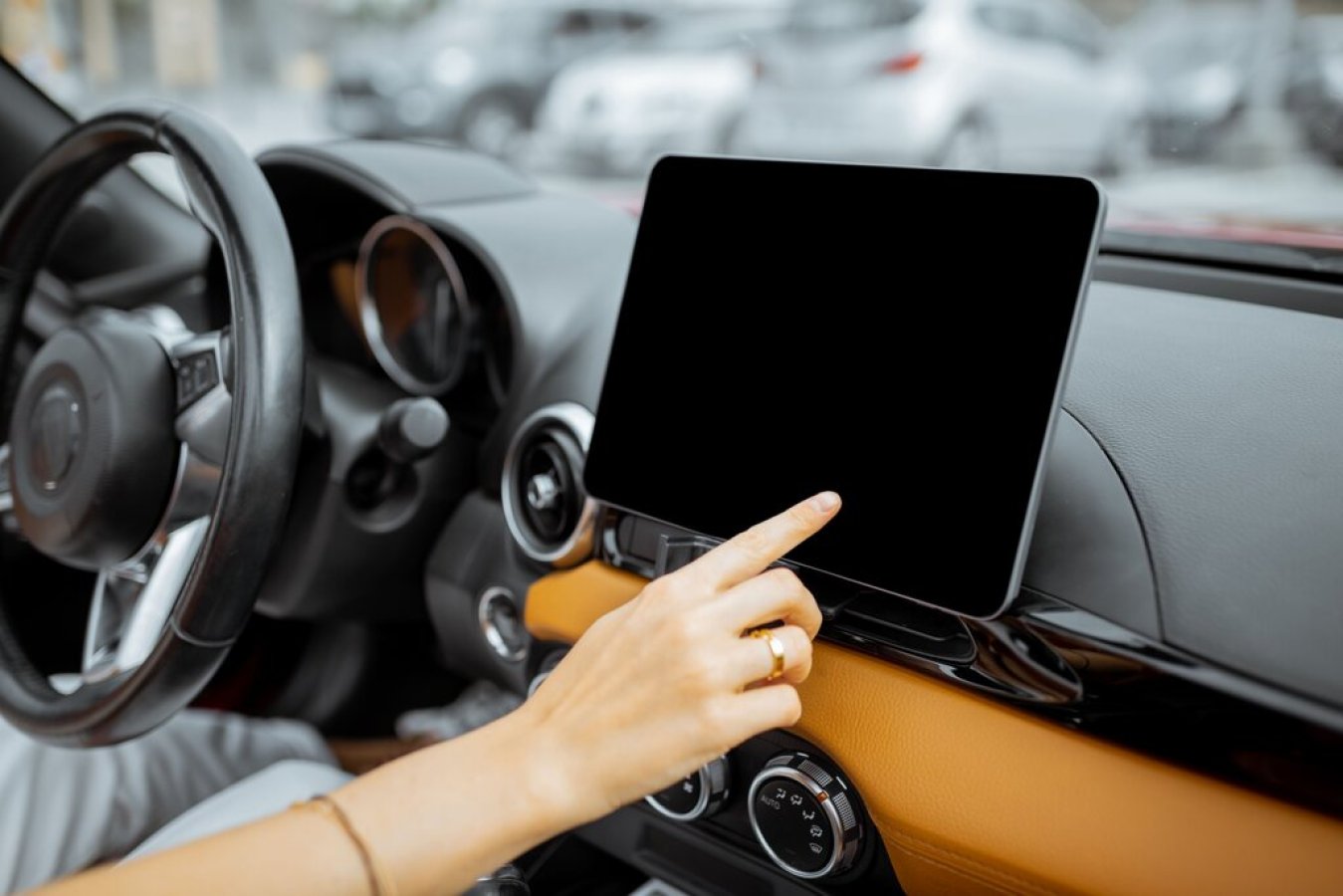
If you peek into almost any new automobile, you’ll either see a touchscreen or a number of virtual buttons aiming to match the role of mechanical ones. But what is their role exactly and how do they bring advantages - or disadvantages for that matter, into your driving habits? Find out in this article.
There’s absolutely no doubt that smartphones and tablets have a great influence on today's cars. If you peek into just about any new car, you’ll either see a touchscreen or maybe even a bunch of touch buttons that strive to correspond to the functions of mechanical switches. The attraction is unmistakable: a car with such design features can be super sleek and elegant, not to mention up to date with our modern needs. However, there can be flaws that aren’t always thought out.
If you haven’t been in a new car recently, you may not know what to examine when considering the technology. Luckily, you can read about the pros and cons that you might want to understand better regarding the touchscreen interface of your new car.
PRO: a larger screen
Because fewer buttons mean exactly that: the screen of your board will be larger. And as statistics show, most drivers like a large screen instead of a smaller one, so when you remove buttons from a car, it gives you more room to expand the screen. Think about the TV or a smartphone, they all got larger in recent years. The trend is also applicable to car screens. When Lexus presented the NX SUV, it had a 7-inch center screen. This was happening back in 2015, and now, in 2022, you can buy a Lexus NX can be had with an optional 14-inch touchscreen. Some models’ screens are even bigger. The Ford Mustang Mach-E has a 15.5-inch center touchscreen, and the electric Mercedes-Benz EQS has a complete dashboard Hyperscreen. Larger screens are more readable, deliver bigger touch marks to interact with, and make it more comfortable to look at the map you're navigating.
With touchscreens, you have to take your eyes off the road to complete most tasks. Recent studies say that an easy task like choosing a tune on Spotify will force you to take your eyes off the street for up to 20 seconds. In conclusion, it is recommended that the devices in your care should be designed so that tasks can be achieved by the driver while driving with peeks away from the route of only 2 seconds or even less time. The research also shows that the impact on response time when using touch control, as opposed to voice, was more harmful than texting while driving.
But if you drive any car long enough, you will learn where items are, instinctively. For example, right now, you would know where the volume button is without needing to look for it - so, without taking your eyes off the road. This could be a problem though for digital virtual touchscreens because you can't feel a button that's not physical.
CON: a central point of failure
While it's awesome to have more additional components in a modern car, the issue with boarding them all in just one single location is that... you guessed it: if the screen runs out, you lose access to all of the features. any of those features. This can happen to anyone on any new car because there can be bugs in the car's software since they are new programs.
PRO: even more features
Today, a new car’s features are expected to perform as twice as more as an old car's components. This means that your new car needs to not only run software but also display features like Apple CarPlay or other smartphone integration systems. Picture the number of controls that would be required to operate all three systems.
From the car creator's perspective, a touchscreen interface saves designers from having to figure out where to add more buttons and gives the interior a sleek look. A wonderful example is the Tesla Model S, where almost every part of the car is located on the main touchscreen. Even some traits you might not anticipate, such as the shifter, windshield wipers, and lights. These are all placed on the touchscreen. Another good example is the Kia EV6: this car has a row of working touch buttons that are utilized for temperature control. However, you can also completely change to stereo commands if you press one specific control. The issue might be that if you want to modify your climate and find the incorrect setting, you might be turning up the volume.
PRO: personalize and customize
Digital controls in a car aren’t physically closed into one area. This is an opportunity for you to customize and personalize your car. On the Tesla Model 3, for instance, you can rearrange the placement of the main on-screen controls to match your preferences. On other smart cars, you can create a profile that contains your steering wheel, seat, and stereo preset. You can also store everything and access your data if someone else driving the car sets their own controls. Because ultimately, every driver has their preferences in the way they interact with a car.
